
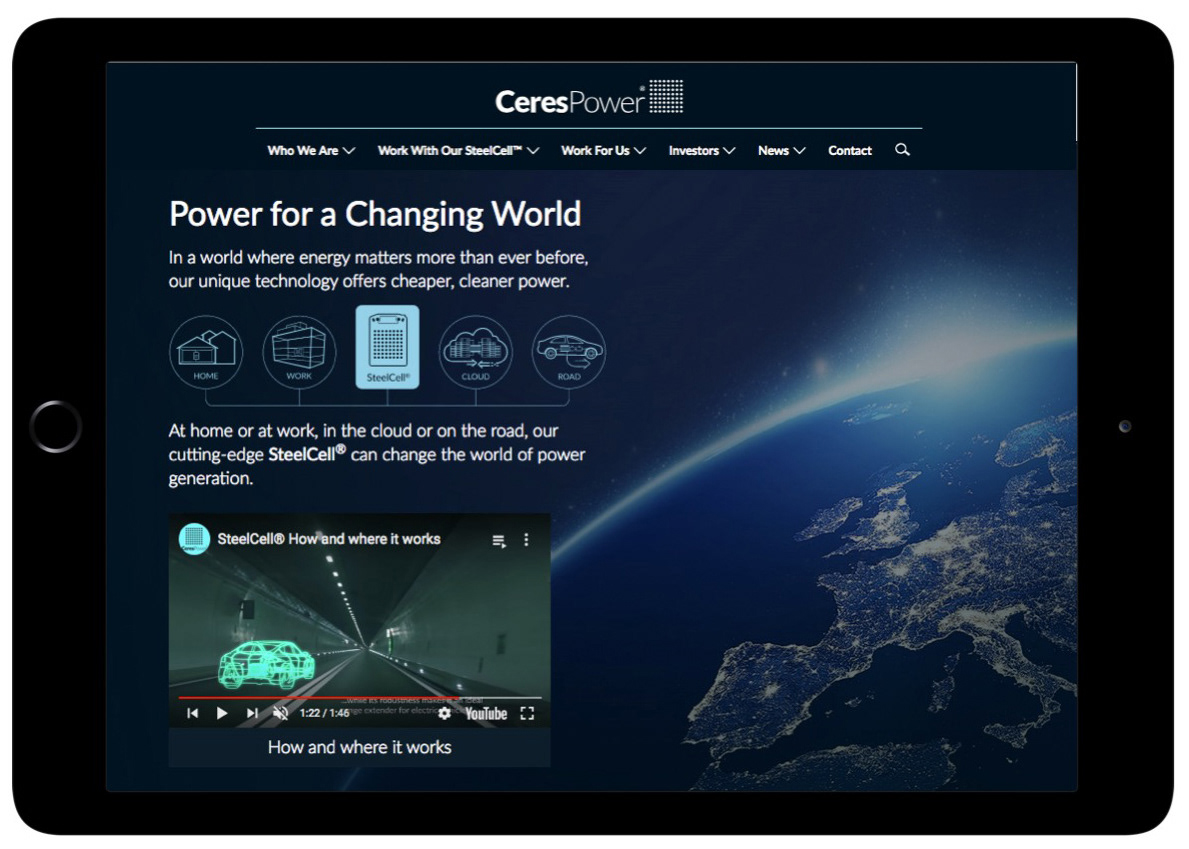
A fuel cell in every home, business and vehicle
CeresPower is now one the UK’s leading Cleantech companies. When we started working together in 2015, they had received a lifeline investment and were setting a new direction for the company, they needed a new positioning to reflect the maturity of their technology and market readiness.
Working with the board, we created a "tech ready" positioning, refreshed their messaging and logo, a new visual language for their website and videos which provided new ways to talk about and market their technology.
Combined with the refreshed investor and customer presentations, the work helped raise £40M and win new clients over four years. They are continuing their stellar growth with world leading partners.
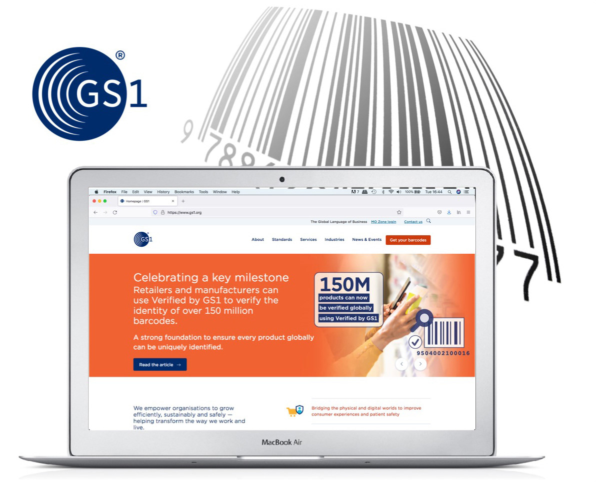
Uniting Global Supply Change Standards Under One Brand
Having supplied consultancy and design services for e-centre, the UK’s barcode standards agency, when they decided to create a new organisation, born out of the union of global EAN & UPC standards, they asked for help in creating the brand for the world’s largest supply chain standards organisation.
Working with the international board, we created a new brand positioning and brand architecture for their services and products. This initial work was globally market tested alongside a shortlist of new names.
The success of the above achieved total buy-in from the global offices, a consensus for the new name and the foundation for a single brand identity and guidelines which we developed.
The identity has been implemented worldwide into their 120 regional offices and their touch-points, today GS1 is recognised as the global supply chain standards authority. It now makes a difference over 5 billion times a day.

Interbrand's BBC Brand Strategy
As a brand video and motion graphics partner to Interbrand, when they were invited to pitch to become BBC’s strategic branding agency, Interbrand asked for my broadcast expertise and knowledge of the BBC to help.
The Interbrand's strategic concept “Power of II” was routed in the idea of moving away form "Whizzy 2" and juxtaposing contrasting elements of the world around us and the channel's content. Co-directing with Interbrand's ECD we delivered the winning pitch for the £1M contract.
Messaging and M&A Brand Strategy
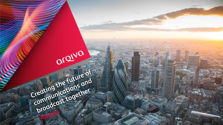
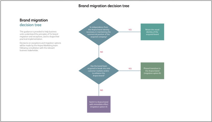
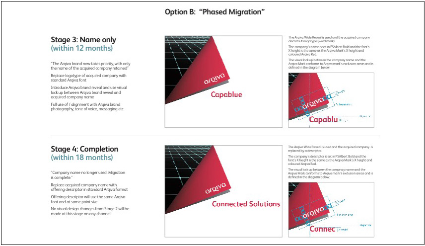
Having grown through acquisition, Arqiva’s positioning and messaging were disjointed. Clients complained that Arqiva was difficult to understand and difficult to do business with. They lacked a single story, instead offering multiple and sometimes conflicting views of who they were, what they did and what made them different.
We created a new positioning and a unified set of sales messages to communicate the core propositions from a customer perspective. We brought consistency, making connections between business divisions and presenting a combined story for the first time. From these core ideas, we created a tool kit for their elevator pitch, boiler plate, web and sales presentations and additional brand migration guidelines to keep consistency as they continued to grow.

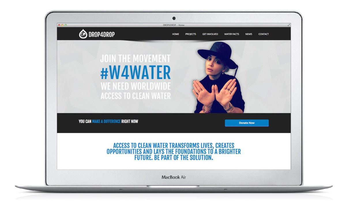
drop4drop.org
The charity’s mission is to alleviate the world water crisis by leveraging businesses to match their drinking water consumption to the volume of water supplied into the developing world in perpetuity.
We created the charity’s purpose, narrative and positioning, name and visual brand concepts, which were market tested and then developed into a "kite mark” proposition for companies to use to communicate their charitable water guarantee.
Drop4drop has so far provided +2million people with clean water to communities worldwide by digging wells in remote regions. Its annual World Water Day awareness campaign, initially reached over 250 million people, with the following #W4WATER reaching over 500 million.
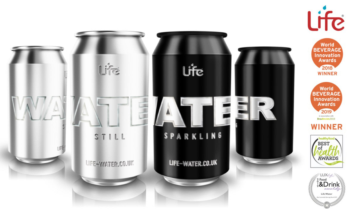
A purpose lead
British water brand
British water brand
The founders, successful trading and investment mangers, wanted to exit the city and create a product with difference. Having seen brokers holding bottles of water as if they were designer handbags, they wondered if this nonessential product in the UK could be embedded with a charitable tax... They asked for my help with positioning, naming, branding and packaging.
Originally designed as completely recyclable PET plastic bottle, it now predominantly sells in cans, which we developed following a request by the Natural History Museum. Life Water sells circa 15million units/year and funds clean water projects across the globe, through its embedded charity partner drop4drop, it is their joint mission to alleviate the World Water Crisis.
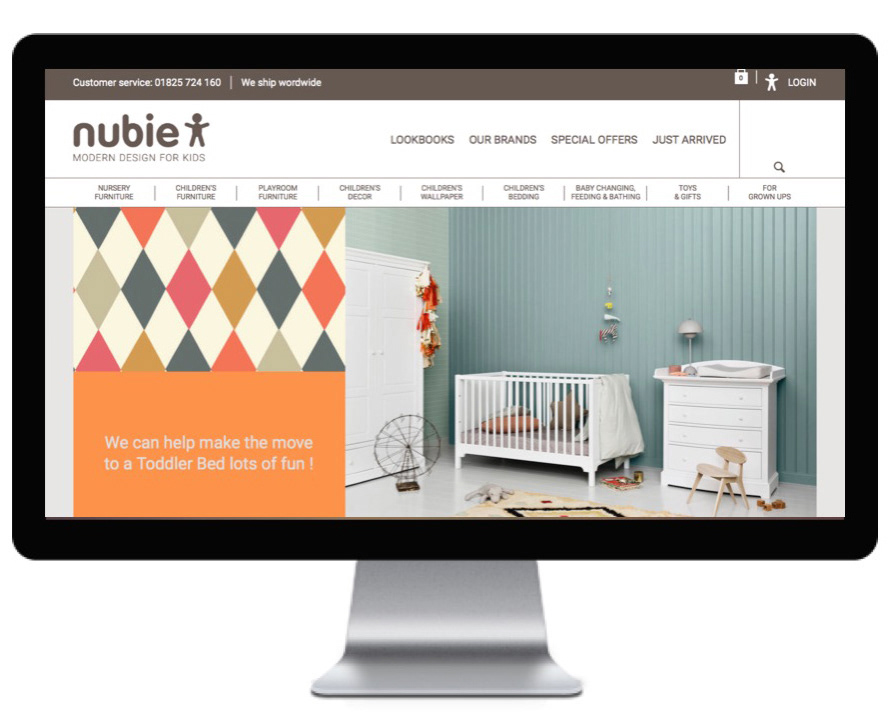
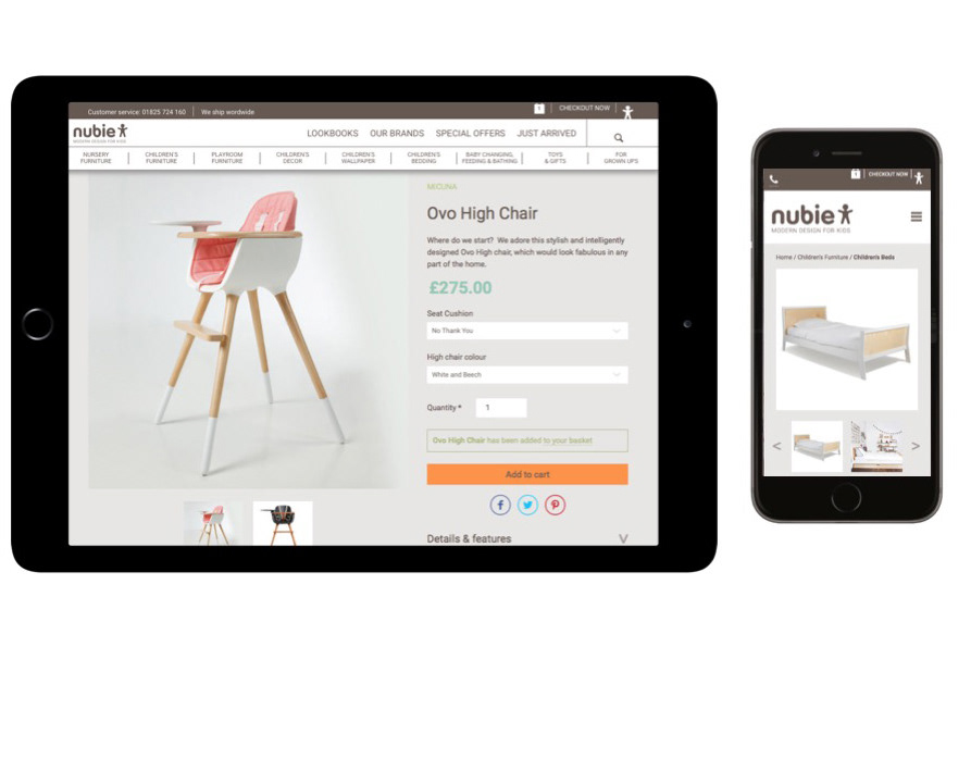
nubie | modern design for kids
Nubie’s founder has a children’s e-retail pedigree, having led Mothercare’s digital transformation. nubie is now one of the UK’s leading premium children’s home furnishing e-retailers, but they were failing to increase revenues due to their website being in need of modernisation and re-design.
Working with Infomagnet, the web developers, we redesigned the UX, created the UI, focused on responsive optimization, which resulted in a 70% increase in sales.
Island Pictures Branding
The founders of this production powerhouse are true islanders, the design concept was inspired by their Isle of Wight origins and their "beyond the horizon” out look on life and work. I "organically" developed the motion branding with my animation team and sonic branding with composer Andy Price.
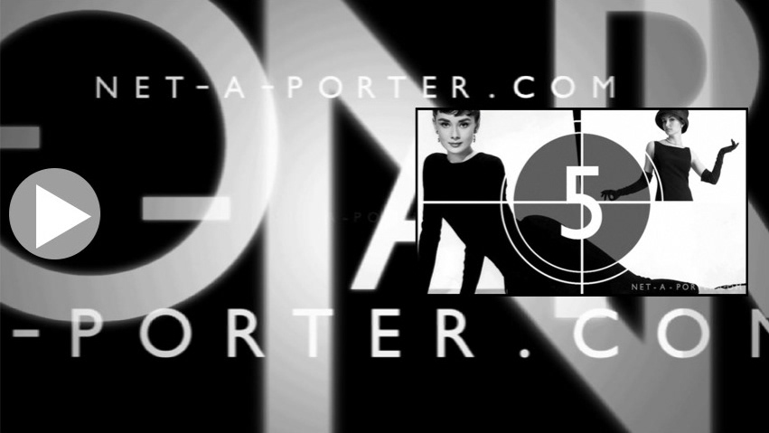
NET-A-PORTER Ident, Channel Branding & Content
NET-A-PORTER wanted to create more video
content in response to customers searching and purchasing an increasing amount after viewings.
content in response to customers searching and purchasing an increasing amount after viewings.
We developed NAP’s motion and sonic
brand ident and created its first mini feature series “Fashion Countdown” to showcase classic moments in fashion featuring iconic fashion moments and interviews filmed in New York and London.
brand ident and created its first mini feature series “Fashion Countdown” to showcase classic moments in fashion featuring iconic fashion moments and interviews filmed in New York and London.